Friday, December 14, 2018
Post 20: Closing Post
Dear Moderator,
Thank you for looking at my blog. To find my research and planning evidence, click on the label called AS research and Planning, which is on the right side of my blog. I hope you enjoyed reading my blog and thank you.
Hayri Olcay(3162)
Post 19: My Finished Adverts
I was very pleased with the final state of my adverts. I believe they clearly portray the brand ideals are memorable to say the least. The end Title is simple but includes all the relevant information to make an inquisitive viewer check the advert out.
The very intensive 3 week editing project was really straining but I believe all the hard work paid off in the the end. If anything the project has taught me a lot about the real world media industry and how precious time is when working on intensive projects.
Post 18: My Target Audience Feedback
I had 2x16, 1x20 and 3x24year olds watch my Adverts either in school or at home and recorded all of their responses onto notes so that I could refer to it later

What I gathered from this:

What I gathered from this:
- The music from both adverts was really cool and two of the individuals asked for the songs name (the 16 year old male and 20 year old female)
- All noted that the final title card with the information looked a little odd and simple for a Tv ad which is a fair judgement
- The 16 year olds both noted how the music was diegetic with the action in both ads (to quote "the beat drops as he breaks his ankles")
- one of the 24 year olds mentioned that the scenario for advert two was odd and that in a real life situation that action would have resulted in an argument
This feedback is useful in helping my future understanding and planning for an advert, one thing being to focus a bit more on making the actions more realistic
Post 17: My Adverts Review
I created a review copy of my adverts so that everyone could see them on the big screen for the teacher/peer review . These were put on exported and uploaded onto Youtube:
This process allowed my peers to watch both my adverts on the large projector, thus exposing minor details more clearly. I noticed that my grading was a bit to saturated and some shots were too bright, so I used a tool on 'ThreeWayColour Correction' which lowered the sharpness of white areas without affecting the rest of the shot. My Peers also noticed that the rim shot was still obviously from another place so I need to crop it down even further so that anything outside the rim's board isn't visible. Sam (the technician) further noticed that, in the shot where the foul takes place, the white hoodie has a purple tint that looks unnatural. Therefore I need to revert the grading I've done and redo it so that the hoodie isn't discoloured.
Post 16: My Roughcut
Creating a rough cut for each of my adverts allowed me to see if my shots could be improved when they were put together. I did this by cutting each shot and placing them in order on PremierPro.
My roughcuts can be seen below:
I found this exercise to be beneficial because I could clearly see if there was continuity between my shots and if the timing element from my practise shoot carried forward into my video. I could see if the lighting changed drastically between shots in my first advert so I scheduled a reshoot for the next weekend (as the lighting can cause problems when grading). Another issue was the change of hoop between shots in advert 2, however in this case rather than reshooting, colour correcting and trimming down the frame may be a better solution. Also in my second advert, the slow motion section at the end needs to be reshot to have the YourFood logo on the brand on the delivery bag (adding it in later via cg looks odd)
Post 15: My Shootboard
A shoot-board was essential for the process as it gave me detailed information in note form so that I could remember how I envisioned my video initially. My shoot board had also been ordered so that the shots could be taken in order of proximity rather than the videos chronology so I could save time.


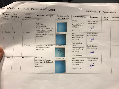


The shoot-board was so essential to my project. It allowed the experience on shoot day to run smoothly as there were very little location changes. I wrote down the number of takes and the best takes for the shots. This made the editing process easier as I didn't have to watch all the shots back to decide what the best take was.
Post 14: My Kit list
Because we had to use the expensive media cameras, it was essential that we made sure we had all of our pieces. It would have been difficult to remember every component of the camera, therefore we had the checklist to help us keep tabs on which pieces were relevant.


This helped to benefit my shooting experience as it meant that I could easily check the list which ensured the threat of losing kit was eliminated as well as relieving some of the pressure of having to remember everything.
Post 13: My Time-Plan, Crew And Cast List
The cast list was created to help me keep track of the actors participating in my shots and the time plan was used in conjunction with our shootboard as it made sure that we did not run out of time during the day to finish our shoots.
The crew and cast list is in picture one (at the bottom) while my timeplan is in picture 2.


The crew and cast list is in picture one (at the bottom) while my timeplan is in picture 2.


Having a full overview of my cast it was far easier to see that I had a range of ethnicities, ages, and genders. This benefited me as it made me more organised for that upcoming shoot, and what actors I needed to book in advance.
Post 12: My Location Reccie, Risk Assessment, And Location Permissions
My Location Reccie, Risk Assessment, And Location Permissions are obviously all vital as they help me find an appropriate location.Risk assessment was a necessary safety procedure so I could be aware of any possibles problems I may encounter during my shoot.
Week 1

Location reccie Images
 Grovelands park court
I chose Grovelands in particular because it had a relatively new court and nice background scenery that the delivery man in advert 1 could run across. The location of it was also close to all of my actors which added to the convenience.

Home
I chose home as the geometry of the house as it provided a living room and sofa that was close to the entrance with enough space to set up a tripod. Naturally with the set being my home, it eliminated all the risks of being outside.
We were warned about lighting and mise-en-scene for the shots and how that would affect our continuity. What posed a problem was that it got dark really quickly, so we had to shoot the shots before 4 pm to ensure that there wouldn't be any lighting issues. The darkness would also provide safety issues as detailed in the risk assessment but thankfully we didn't encounter anything during the shots.
Post 11: My Practice shoot
The Practice shoot was significant as it gave me an idea as to if my shots were do-able and if my concepts could accurately be portrayed in the 30 second time limit. I tested this by filming and editing a practice shoot of the adverts on my phone.
Overall, I can say that i am fairly confident in the way the rough cuts ended up. Even without narration and music, you can understand what was intended and both adverts and the timings are really close to where they should be. However, there were issues with lighting in my second advert where the sun was too bright and thus cast long shadows into my shot. To make this less obvious next time, I will shoot on a cloudy day at midday so that the extent of the shadows are minimised. The first advert's acting proved a little harder, the celebrations looked mechanical and the way the shot pans out makes the whole situation hard to watch. I suggest that in the next attempt, these few shots with the opposing team be cut as that would mean the scenes flow better with major cuts from setting to setting.
Post 10: My Advert storyboards
Using my timelines from the last post, I was able to construct two storyboards to help convey my ideas more physically. I drew each of my shots onto a post it note (with the shot type) and stuck them down onto an A3 sheet of paper. The post its had the added benefit of allowing me to reshuffle, change or redraw shots as i saw fit without affecting the rest of my piece.
Shootboard 1

Shootboard 2

These storyboards were a great visual aid to help me understand how the viewer would see my advert. This enabled me to ask what changes I could make to my advert as other classmates could understand generally what would be shown.
Post 9: My Advert timelines
My advert timeline, as seen below, was vital to the production process as it helped me plan each shot so that it would fit within the strict 30 second cut-off. additionally it was the gateway into making my storyboard and focusing on how these shots would be presented.

The planning was essential because the complete breakdown of my 30 seconds it provided helped me have a tight time frame from each shot. This helped me visualise my advert and ensured that I wasn't compromising the brief (time wise). These timelines helped me later plan my story boards which was the backbone for my shots coming together
Post 8: My Initial Proposal
I have two distinct ideas for 30 second fast food adverts. From the brief, considering the target audience was 16-25 year olds, to meet their requirements I decided that a cast of teens in both adverts was essential and that both males and females were represented. The target audience also had to be in a defined geographical region. I made sure it would be relatable to the target audience by using common locations such as a house and a public park. The brief also states that the adverts should use techniques such as humour to engage the target audience. I took inspiration from the 'Balti Rocks' advert by Just Eat where after the logo is shown there is a final humorous end scene. I planned for this to happen in both my adverts in order for the adverts to be more memorable and to emotionally appeal to the audience. Both of my adverts also had to use the same tagline thus adding to the memorability. Therefore I made a tagline reflected this, and I came up with "Drop it while it's hot".
Advert 1:
- The advert starts off with a dishevelled player knocking on the door to his home
- door opens, sister greets him, he continues walking in giving the cold shoulder
- sister has a little internal monologue
- decides Your Food is the best solution
- Whips out phone and orders Your Food
- Food comes immediately
- she rushes to the door with glee
- quickly brings food to depressed brother who springs to life and dives at the food in slow mo (consistent theme between both ads)
- The player's face should light up like in the the "Balti Rocks" advert
- Ad starts off with a protagonist's basketball montage
- Player gets shooting fouled
- he gets ready to take shot
- realises he's not playing well because he's hungry
- whips out phone
- orders Your Food
- Delivery man is seen running in distance
- Everybody turns and runs to get the food first
The slow-motion at the end will be inspired by the Strongbow: "Earn it" advert
Making an initial proposal has helped me shape my ideas and make a first step towards making a complete plot for my advert. I will progress my developing the idea and putting in the form of a timeline and storyboard to gain a greater idea of what the advert should look like. I thought it was significant to include the brand values of being fast, reliable and diverse because that was something that important in my target audience research.
Post 7: Research into Existing TV Commercials in Other Forms (e.g. Online, Print, Billboard)
I researched other adverts in order to learn more about other methods of advertising. In particular, looking for ideas for my slogans and branding, as well as pinning down similar advertising techniques. Many of these other forms are single still images, so looking at these will help educate me on how successfully appeal to the audience.The best examples of print ads I could find are below:
 I personally found this advert of the treats controlling the dog to be on its best behaviour to be particularly memorable. As a member of the target market of 16-25 year olds, the idea of joining pets with a concept such as gaming (two positives) makes it something that really evokes my interest. It also has the bonus of evoking a chuckle and is adorable in general thus making it one of the best print ads to this day
 A voluntary group (called "mom's demand action") was trying to raise awareness towards the idea of gun reforms, especially with 2017 and 2018 having a high number of school shootings. The focus is to show one banned item thats relatively harmless in comparison to the firearm. The advert features children carrying weapons, alongside classmates holding either a Kinder Surprise egg, the book ‘Little Red Riding Hood’ and a ball from the schoolyard game Dodge-ball. The strong contrast is meant to evoke a response which it does successfully
French Ministry of Health
This ad campaign for the French Ministry of Health highlights the growing the growing issue of obesity in children. An original concept, the illustration, art directed and copy written by David Lesage, features an image of an ice cream, topped with a big belly. The copy reads “L’obesite commence des le plus jeune age,” meaning “obesity starts at a young age.” This advert uses weird imagery to attract the intended audiences eye, then enlighten them with the aforementioned caption, thus fulfilling its purpose.

This Advert is simple in nature and is a nifty way of showing their slogan. The simplicity of it paired with their new "it's sugar free" Slogan definitely makes it a memorable poster.
In conclusion, conducting this research showed me that colour is extremely helpful in branding and connoting brand values, something I will keep in mind when designing my logo. Having a quirky trope also helps make the advert stand out and become more memorable so I should aim to include one in my adverts.
Post 6: Research into Existing TV Commercials (Other Genres)
Other genres of adverts could provide me with useful insight into how i could project my campaign so thats its distinctly different from other adverts in the genre
All of the food related adverts used close up shots with the actual food being advertised, albeit with the common advert food techniques (e.g. injecting fat into the meat to make it look bigger). This entices the audience that is watching the unrealistically good portrayal of the food, thus creating a strong desire to obtain said food.
I believe that M&S gives a strong representation of how the adverts play with the viewer's cravings.
M&S:"Spend it well"
- At the start of the advert, Ed Sheeran's 'Shape of you' is playing. the significance of this is that its is a song that most people are familiar with (since it did so well in the music charts) thus making the audience associate the food as something they're familiar with.
- The editing in the video is very clever, with many closeup and mid shots of the food, each couple shots of the food is interspersed with a shot portraying an element of nature that has the same movement as the food which makes. This makes the advert memorable since it's so satisfying for the viewer to watch. Since the food has been prepared so nicely we get a sense that M&S brand values represent good quality and tasty food with exciting flavours and textures, which, through the highly slick video and high end branding of the logo (black and white), looks as if is aimed at a more middle class audience.
- The editing of the shots also makes the advert run smoothly and the continuity between shots (with time jumps in the preparation process) make it seem like this 'delicious food' is ready to be served in what seems to be an impossible time frame.
- There is a voiceover throughout the whole advert asking rhetorical questions about the viewer's current food which engages and persuades he/she to buy the delicious food shown on camera at M&S. This voiceover goes through to the end, where on screen text of 'M&S Spend it Well' is shown.
M&S: "Adventures in imagination"
- most of the shots are close ups of the different types of food on display in order to highlight the delicious tastes of them.
- As the food is centre stage in these adverts the audience attention is focused onto it, helping to persuade the audience to purchase it.
- The huge emphasis on the food makes the audience feel hungry, and the vibrant colours in the advert holds the audiences attention throughout it.
Post 5: Research into Existing TV Commercials for Take-away Food Delivery Services
I researched existing adverts for take-away delivery services to understand the conventions used and how I could use these conventions in my own advert that the audience would expect to see. Analysing the videos closely helped me understand exactly how adverts and representations are created, allowing me to take inspirations for my own advert.
When looking at the adverts, overall, they tended to contain:
With La La Land being such a big hit at the box office, this magic is real advert focused on recreating it's style. The Jazzy and musical theatre esque video makes it easy for all audiences familiar with La La Land automatically associate the two.
The idea of coming off as an all inclusive brand is accentuated by the wide-scale diversity of the people featured in this advert. This broadens their demographic and helps highlight them as an all inclusive brand
The use of a generic looking street with the exception of it all being fast food joints is a quick way to plug in all associates of the company and convey the service as being one massive unit
At the end of the trailer, the advert uses satire in the form of having the delivery man keep singing, even after the music has stopped. This is to make the service seem a little goofy and friendly as well as evoking a chuckle (thus making the viewer more likely to remember the advert)
When looking at the adverts, overall, they tended to contain:
- Satire
- Intertextuality
- A wide palette of actors from different ethnicities
- Extensive social media presence
- A fast and simplified delivery process
- An RP accented individual with a likeable voice doing a voiceover to further explain the ad
- Massive/colourful logos everywhere
However, for adverts to be memorable and impactful, the advert must include one of these conventional techniques:
- Humour
- Emotional appeal
- Intertextuality
- Genre hybridity
Deliveroo's "Eat more amazing"
In the advert, we can clearly see the food levitating on roads, thus giving the impression of that the food comes straight to your door. The foods and restaurants featured in the advert are there to promote not only themselves (as the viewer associates the restaurant chain with Deliveroo), but also helps promote the restaurant chain. These two factors support the brand value of focusing on the food and its quality.
Just Eat's "Magic is real"
Just Eat's "Magic is real"
Just eat: "Man band"
- relatableThe advert starts in an ordinary living room, this is to try and cement the whole advert into reality and make the beginning
- Each of the singers is referring to a different type of food, thus highlighting the wide range of selection that Just eat possesses
The rest off the advert is over the top singing which adds a satirical element to the whole ad (thus making it more memorable)
Once the main chorus begins, theres is a change of pace and camera angles, this change is meant to interest the viewer thus keeping them engaged until the ending where we hear the really catchy motto of 'Tap the app and get that mini fist bump feeling". This stays in the viewers mind, thus making the advert more effective
These adverts provided essential insight into my competition in the market and it gave me a couple of ideas about what my adverts could be about while also finding out the many conventions that I should follow in my adverts such as an ending title card.
Monday, December 10, 2018
Blog Post 4: The Target Audience (Males And Females Aged 16-25)
This next blog post relates to my findings on my target audience:
Knowledge on a target audience is essential as it helps shrink down our advert's requirements in order to achieve our desired effect. With regard to my target audience of 16-25 year olds:
A quote from Visual Capitalist says, “In 2011 the average 18 to 25-year-old millennial watched around 25 hours of traditional television per week. Today, they watch closer to 14 hours per week.” Thus indicating to me that theres a smaller window that a majority of people acc watch tv.
A quote from Visual Capitalist says, “In 2011 the average 18 to 25-year-old millennial watched around 25 hours of traditional television per week. Today, they watch closer to 14 hours per week.” Thus indicating to me that theres a smaller window that a majority of people acc watch tv.
A survey from Business Insider revealed that “61% of Millennials say Netflix is their first or second choice for watching TV.” Considering our target market is also includes 20-25-year olds, we must take the lower percentile of millennials into account as well, thus making this information relevant. Gen Z (which encompasses our 16-20 year old market) shares a similar interest this Defy Media survey shows that for 13-24-year-olds, YouTube is a “must have,” meanwhile only 36% of those consumers pay for traditional TV. In fact, 71% of Gen Z consumers have a Netflix subscription. Gen Z would rather engage on social media rather than on TV and bouncing off this point Snapchat is the best option, about 60% of all 18-24-year olds use the app. Only 27% of 25- to 34-year-olds are on Snapchat. (according to comScore)

When referring to data obtained on millennial shopping habits, PFSweb dictates that 80% of millennials said that the mobile advertisements sparked their interest in a product. 54% of participants said that shopping apps provided a tempting transition into buying a product as it was far simpler. the significance of this is that the advert we're making focuses on a fast food app making the advertising of our product easier. About 35% of millennials said that they'd be happy to complete their purchase on a mobile device if the process was easier but it should be noted that the average 18- to 34-year-old lays out roughly $2,000 annually in eCommerce. This means that it is advantagous for our advert to focus around a mobile app and the glory of said app rather that the company in general.
In Conclusion: the fundamental points to take away from the research is:
- To focus on the mobile app, rather than the company in general
- Millennials love social media so that is a golden ticket into the desired audience's attention
- People are more likely to buy food if it's easy to obtain (so I must entertain that idea in my adverts)
- Snapchat esque adverts may be welcomed better on Tv
Blog Post 3: The ASA BCAP Code
Information on the ASA's code of conduct:
I researched the ASA so that I knew what restrictions and rules TV adverts adhere to in order to be approved for broadcast. This helped me as I learnt what my ad could contain and this was taken into account when considering my initial planning, idea and consequent proposal.
Main code of Conduct (from the ASA website):
Advertisements cannot cause physical (as a knock-on effect) or mental harm to those who are susceptible/vulnerable. broadcasters are held accountable if an aired advert does not comply with the codes of conduct. The ASA has the right to reject investigation of an advert in which case other regulatory bodies (e.g. court) should be engagedImportant information to take from superiority claims/competition.
- Any and all claims to superiority must be backed up with legitimate factual evidence (meaning our adverts couldn't claim superiority as there was no company to praise)
- a direct quote from the ASA: "Advertisements must not create confusion between the advertiser and its competitors or between the advertiser's product or service, trade mark, trade name or other distinguishing mark and that of a competitor." This is obviously to prevent other companies from riding off the success of an individual company.
- The ASA also made it obvious that attempts to "take unfair advantage of the reputation of a competitor's trade mark, trade name or other distinguishing mark or of the designation of origin of a competitor product or service." meaning our adverts and company's likeness couldn't look similar to or imitate another existing fast food service. Therefore, plays on existing conventions used by other fast food adverts couldn't be used as this would risk infringing the ASA rules
- Our Adverts (for the obvious reason that our ads have to reach individuals under the age of 18, our age range is from 16-25) cannot feature any spirits or items that are bad dietary behaviour as this would undermine progress towards national dietary improvement.
Rules regarding religious portrayal (if any):
- Do not portray a particular faith (or their preferences) in a negative or disrespectful manner
- protect the young and allow parents to exercise choice in their child's moral and philosophical education
- an example of an advert that broke the ASA's code of conduct can be seen below:
The significance of the research was that it showed me the main rules to consider when making my advert and how to keep the adverts suitable for the audience watching the program at the time of the commercial break. I will take this information forward into the planning phase and proposal phase, to ensure my adverts fully fit the brief –which means my ad must adhere to the ASA’s guidelines.
Subscribe to:
Comments (Atom)